Wednesday, December 18, 2013

Extra Credit.

1. Explain what happened to the man that was killed by the subway and how the photographer was able to take the photo. 

A man named Ki Suk Han was pushed by an unidentified person. The photographer claims to be trying to warn the train conductor by flashing the light on his camera.
2. Why did the photographer say he took the photo?
The photographer claims to be trying to warn the train conductor by flashing the light on his camera.
3. Do you think the photographer should have taken the photo?

In my opinion I don't he should've taken it.

4. Do you think the photographer did the best thing he could have done in this situation? Why or why not?
I don't think he did because if it were me I would've tried to call people over as quickly as I could to help me get him up off the track.
5. Do you agree or disagree with the decision to run the photo on the front page of the New York Post? Explain why or why not.
I disagree strongly with the decision to run the photo on the front page because that's kinda invading that man and his families privacy. Now all of New york knows about it.   

6. What is more important to a photojournalist, capturing images of life as it happens or stopping bad things from happening? Why or why not?

Sadly it's capturing life as it happens because as long as their not being effected by what's happening they'll take the photo.

7. Do you think it is ever ethically acceptable for a photographer to involve himself/herself in a situation that he or she photographs? Explain why or why not.
Only in certain situations. Because in this incident a man was killed but if it were something less dramatic then yes it's fine.

8. Should photojournalists always avoid influencing events as they happen? Explain your answer.
I feel in only some cases. Because in this case the photographer should've put his camera away and helped more. The way he said he tried to help was ridiculous. 

9. After reading the responses from the professional photographers, what stands out as the most appropriate response for a photographer to this situation.

What stands out is how everyone is saying how you can't really tell if what he did was wrong or right because no one was there in his position.

Final Exam.


CAPTION WRITING.


John Jones rides his horse through the bonfire on Saturday night in Boston. Jones rode his horse proudly after the boston union finally got their freedom from the U.S.


Governor Maddy Wilson yells at President Barack Obama Friday evening at the Austin international airport. Wilson yelled at Mr. President about not having signed the new state law for women's rights the day before. 


Bubba the Rhino flies back home to the African wild on Sunday morning. Bubba was carried back home after being treated at a near by hospital after being attacked by Lions.


PHOTO COMPOSITION.


In this photo one rule I can see is simplicity. It's simplicity because all you see in the photo is the man making a speech while there is no distractions in the background, just a blue sky. Another rule I see is Rule of thirds because the subject is in the bottom right frame of the picture.

In this photo you can see the rule of depth in it because in the photo you can look all the way down the tunnel of green trees and leaves. Also in this photo you can see Rule of thirds since the subject is in the bottom right corner.

In this photo you can clearly see the Balance with the Olympic rings and the moon. If you were to split the photo in the middle in will fit perfectly together.

In this photo you can see the rule of lines because the lines on the ground direct your eyes to the finish line. Another rule I see is Mergering and avoiding mergers because there is a runner in the photo where you can only see half of his body.

Monday, December 9, 2013


Self Portraits and Portraits

1. Obviously, you don't want to have to haul all out and run into the frame just as your camera takes the image. Give yourself plenty of time to get in position and figure out what you're doing. Most cameras let you vary the length of the timer, check your manual for how to set yours.
2. Bring Something to Focus On.

Environmental Portraits
I like this photo because it seems really peaceful.
I like this one because it really shows what the subject does in their environment.

Formal Portraits 
I like this photo because every time I see this photo I think of he one where he stuck out his tongue. It's totally opposite.

I like this photo because its really funny.

Casual Portrait

 I like this photo because this couple look very comfortable.
I like this photo because it seems like the subject is happy and peaceful.

Self Portrait
I like this photo because it kinda feels as if the camera is a gun.

I like this photo because its feeling balanced and eye opening.

I'll be shooting a self portrait in my room doing a activity. I'm not too sure what I'll be doing yet. To make the shot successful I'll have to be creative and unique about the photo. I will also have to have good lighting, positioning and set the timer correctly.


Tuesday, December 3, 2013

Rules of Photography Part 2

Rule of thirds


Balancing Elements


 Leading Lines


Symmetry and Patterns (repetition)


Viewpoint


Background


Create depth


Framing


 Cropping


Mergers and avoiding them

Friday, November 22, 2013

ISO

ISO 200

ISO 6400

1. What are the advantages of shooting with a higher ISO setting at a sporting event like a night football game? It helps the light become more visible in the photo.
2. What suggestions did the author make about using a low ISO? Use it only when it's
3. What suggestions did the author make about using a high ISO? Use it only when it's dark out.


F4 Goes well with 1/125 seconds

F5.6 Goes well with 1/5.6 seconds
F8 Goes well with 1/60 seconds
F11 Goes well with 1/60 seconds
F16 Goes well with 1/30 seconds
F22 Goes well with 1/8 seconds

As the F-stop goes lower in number the more blurry and brighter the photo gets.

The photo becomes less visible, in order to see it you must adjust the f-stop.

I would say the longest is about 3 seconds.


I got a 91% on the quiz

Wednesday, November 20, 2013

Shutter Speed

High shutter speed.
Low Shutter Speed.


a.) the dunking booth. High shutter Speed
b.) the food eating contest. Medium speed
c.) the rock climbing wall slow. Shutter speed
d.) someone working at a booth. Medium speed.
e.) the DJ/MC working at the middle of the circle. High shutter speed
f.) the Diamonds performance. Medium speed.


a.) the dunking booth Medium Speed.
b.) the food eating contest Low speed
c.) the rock climbing wall Low shutter speed
d.) someone working at a booth Low medium
e.) the DJ/MC working at the middle of the circle Medium speed.
f.) the Diamonds performance. Low speed.

In Aperture Priority you mode set the lens aperture & the camera automatically sets the shutter speed.

By setting the camera to Shutter Priority mode you have to set the shutter speed, while the camera automatically puts the aperture in for you.

In manuel you set both the shutter speed and the aperture.

Aperture

F 2.8
F 16 


1. What part of the body should we closely relate aperture? Your pupil.
2. Finish this sentence - the smaller the Aperture Setting, the higher the Aperture number.
3. In your own words tell me how aperture impacts Depth of Field?

Thursday, November 14, 2013

Caption Writing: 5 Ws and H.

1. Tom Hanks kisses Lucy Washington on Monday morning at Time Square New York City. Hanks grabbed Washington and kissed her passionately, after returning from the war after he heard the allies had  defeated the Nazis.


2. Mary Kate screams out of terror at 10 a.m. Monday Morning on the campus of The University of Florida. Kate kneeled down on both knees crying loudly, after realizing her boyfriend was shot in the head.


3. A man by the name of John Smith jumps to his death on September 11th at New York City. Smith leaped out of the burning building after an airplane crashed into the 157th floor.


4. Albert einstein smiles to a camera on Tuesday night at a late night bar. Einstein smiled greatly funny at the camera after figuring out a new scientific discovery.


5. Amber Rose looks in terror as her town burns down in flames on Saturday morning at Gainesville, Florida. Rose Gathered both of her kids quickly, as the army invaded their town.


Tuesday, October 22, 2013

Mural Project Preview

1. A theme I would use is probably the diversity here at Akins. There is so many different types of people here. Unlike schools like Westlake and Conelly.

2. I think this theme is worth devoting time because it shows how different we are & I think kids will care about this because they also get to see how diverse we really are.

3. One advantage is that it'll be quick and easy to hold the camera. A disadvantage is that a phone wouldn't give you all the good details in a photo.

4. One advantage of using a SLR camera is that the photo will come out great and detailed. One disadvantage is the app is used for phones so how would we upload them to the app from the memory card?

5. I think we should use SLR cameras because it helps the picture come out better and I feel it'll show a story in the picture clearer.

Friday, October 18, 2013

Power Point Reaction

I found the powerpoint to be very amazing. I liked how the photographer got all the good angles of the animals. I also liked how the photographer edited the pictures to black and white. Another thing I loved about this power point was how close up some of the pictures were and the details you could see.

This photo is my favorite because I know this photo was difficult to take because this photo was timed perfect, right when the elephant threw the sand on its self and the positioning is perfect. I know it was tough to get the good positioning because the elephant is moving and to frame it well most of took some time because its huge.

Simplicity is the rule shown here, the rule is simplicity because the elephant is the main focus and you can't really see anything in the background to distract you away from the animal.

A. Pentax 67II with only two fixed lenses.

B. The reason for him taking this photos was to show that these animals have equal ability in life just like humans.

C. He's hope to show the world how beautiful africa is and the animals

D. "You wouldn't take a portrait of a human being from a hundred feet away and expect to capture their spirit; you'd move in close."

Academic Shoot reflection.

1. What challenges did you encounter while trying to get the photos following the rules I set out for you? 

I had trouble trying to find the right positioning to follow the rules. To me lines was one of the hardest rules to follow.

2. What technical aspects of photography or the assignment in general (focus, framing, holding the camera, etc.) did you find yourself thinking about the most? Provide a specific example of what you did to do this correctly.

I found myself focusing the camera a lot because some of the objects were pretty hard to get because the subjects were moving and doing there own thing. Also holding the camera was difficult because sometimes you have to put your body in awkward positions to get great photos.

3. If you could do the assignment again, what would you do differently now that you know some basic rules of photography?

If I could do the assignment again I would try to focus more on the proper rules and follow them more than I thought I should.

4. What things would you do the same?
I would continue to try different things like positioning wise.

5. When you go out with your next set of prompts, which rule do you think will be the easiest to achieve?

I like the easiest would be balance.

6. Which rule do you think will be the hardest to capture?

I think the hardest would be lines.

7. What rule are you still not totally clear on and what can you do to figure out what that rule is?

I don't really understand framing to well & I can look up some photos of framing and get a clue or hint of what framing is about.

Monday, October 7, 2013

Academics Shoot.

Rule of thirds.
1. I feel I sorta followed the rule it was tough finding a good picture.
2. The subject is a kid doing an online assignment.
3.I feel it is.
4. I could've probably put myself in a better position.


Balance.
1. I feel I followed the rule well.
2. The subject is a group of students in choir reading their lyrics and tones.
3.I feel it is clear to viewers.


Framing.
1.I feel I followed the rule good.
2. The subject is the Teacher giving instructions.
3. I think it's clear to the viewers.


Lines.
1. I feel I followed the rule but barely.
2. This photo shows two students looking onto a harvest of plants. 
3.I feel it sorta hard to see it but it's there.
4. Maybe figure a way to see the line clearly.


Avoiding mergers.
1.I feel I followed the rule well.
2. This photo shows three athletes talking and about to work out.
3. I think it really visibly to viewers.


Simplicity.
1. I feel I follow the rule well.
2. This photo shows a students working on assignment. 
3. I feel it's clear to viewers.


Thursday, October 3, 2013

Academics/Community Service

This is action because you can see a chemical exploding from the cup and it's emotion because she looks pretty amazed by the explosion.


To me this picture tells a sad story because they're all gathered up together around a flag pole with their  heads down holding hands. It seems as if something bad happened and they're praying together.


This photo is most interesting to me because it's really funny how the students are messing with the teacher. I rarely ever see something like this.


1. I like this photo because it shows teamwork within a group of girls on a science lab.
2. I find this photo to be balanced.


1. I think I could get photos like the ones I saw today in classrooms like science, also in a art or dance room.
2. I would like to Coach randolph's class or Mrs.Sells.
3. To get good photos like these I would have to be in great position and be ready for a good shot.

Friday, September 27, 2013

Elements of Art and Principles of Design

Lines are marks made by a pointed tool: brush, pencil, pen, etc. Lines can vary in width, direction, curvature, length, or color.


I chose the painting of the bull because someone obviously used lines to draw the bull.

I chose the photo of the ceiling because it shows lines going up the building.


Shapes are formed wherever the ends of a continuous line meet. Geometric shapes such as circles, triangles or squares have perfect, uniform measurements and don't often appear in nature. Organic shapes are associated with things from the natural world, like plants and animals.


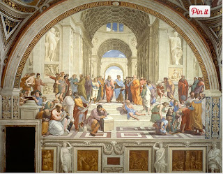
I chose the photo of the man and women because if you look close enough you can see the shapes used.

I chose the photo of the gate because you can see the squares in between the fences design.


Color wheels show the primary colors, secondary colors, and the tertiary (intermediate) colors. They also show the relationships between complementary colors across from each other, such as blue and orange; and analogous (similar or related) colors next to each other such as yellow, green, and blue. Black and white may be thought of as colors but, in fact, they are not. White light is the presence of all color; black is the absence of reflected light and therefore the absence of color.


I chose the photo with the man touching the sky because it shows plenty of colors in the picture.

I chose the photo with the lights and colors because again it shows plenty of different colors throughout the picture.


Value, or tone, refers to dark and light; the value scale refers to black and white with all gradations of gray in between. Value contrasts help us to see and understand a two-dimensional work of art.


I chose the photo with the man holding a silver globe because it shows the contrast between the black and gray in the photo.

I chose the photo with the animal skull because in shows gray and black, also it shows a nice dark side in the photo.


Form describes objects that are three-dimensional, having length, width, and height.


I chose the photo with the Police officer and the boy because it looks like a photo, which appears to look 3-D.

I chose the photo of the building because you can see the 3-D features of the building.


Texture can be rough, bumpy, slick, scratchy, smooth, silky, soft, prickly--the list is endless. Texture refers to the surface quality, both simulated and actual, of artwork.


I chose the painting on the left because it gives off the soft feel to the viewer.

I chose the photo on the right because you can see the roughness on the rocks through the photo.


Space refers to distances or areas around, between, or within components of a piece. Space can be positive (white or light) or negative (black or dark), open or closed,shallow or deep, and two-dimensional or three-dimensional.


I chose the photo on the left because you can see the space between the sticks.

I chose the photo on the right because you can see the windmills and how far away they are from each other. 


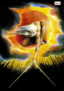
Balance is the comfortable or pleasing arrangement of things in art. There are three different types of balance: symmetrical, asymmetrical, and radial. The human figure is symmetrically balanced; the same on the left and right side. The tree is asymmetrically balanced; its branches are not distributed equally on each side, but their total weight is balanced left and right. The sun is an example of radial balance; all its rays are equal in length from the center.


I chose the upper photo because you can split the picture in half.

I chose the lower photo because the painting looks identical on both sides.


Contrast is created by using elements that conflict with one another. Often, contrast is created using complementary colors or extremely light and dark values. Contrast creates interest in a piece and often draws the eye to certain areas. It is used to make a painting look interesting.


I chose the photo on the left because it shows the dark and  light  in the picture.

I chose the picture on the right because you can see the zebras black and white stripes.


Emphasis in the focal area of an artwork gives it importance. An artist may stress some elements of the design over others. The eye of the viewer will focus on the area of emphasis or center of interest first, then take in the rest of the composition.


I chose the photo on the top because the you can focus on the different things in the photo.

I chose the photo on the bottom because it's very eye popping and makes you focus on the tree.

Movement in an artwork means the artist is taking viewers on a trip through the work by means of lines, edges, shapes, and colors often leading to the focal area. Movement is a visual flow through the composition. It can be the suggestion of motion in a design as you move from object to object by way of placement and position. Directional movement can be created with a value pattern. It is with the placement of dark and light areas that you can move your attention through the format


I chose the upper photo because it shows the people in the painting moves and dancing.

I chose the lower photo because it shows the water flowing down into the pool.


Patterns are made in art when the same shapes or elements are repeated again and again. Pattern uses the elements of art in planned or random repetitions to enhance surfaces of paintings or sculptures.


I chose the upper photo because you can see the pattern between the people and how it never ends.

I chose the lower photo because you can see the repetition in the pictures with the arrows.


Rhythm is the repetition of shapes, lines, and forms. Rhythm is a movement in which some elements recurs regularly. Like a dance, it will have a flow of objects that will seem to be like the beat of music.


I chose the photo on the top because you can the rhythm in the picture with the soup cans.

I chose the photo on the bottom because you can see the repetition in the photo with the flags.


Unity means that all elements in an artwork are in harmony. Unity brings together a composition with similar units. For example, if your composition was using wavy lines and organic shapes you would stay with those types of lines and not put in even one geometric shape.


I chose the top picture because you can see the same shapes throughout the picture between the tree and explosion.

I chose the bottom picture because you can see repetition in the photo with the waves flowing through.