1. A theme I would use is probably the diversity here at Akins. There is so many different types of people here. Unlike schools like Westlake and Conelly.
2. I think this theme is worth devoting time because it shows how different we are & I think kids will care about this because they also get to see how diverse we really are.
3. One advantage is that it'll be quick and easy to hold the camera. A disadvantage is that a phone wouldn't give you all the good details in a photo.
4. One advantage of using a SLR camera is that the photo will come out great and detailed. One disadvantage is the app is used for phones so how would we upload them to the app from the memory card?
5. I think we should use SLR cameras because it helps the picture come out better and I feel it'll show a story in the picture clearer.
Tuesday, October 22, 2013

Friday, October 18, 2013
Power Point Reaction
I found the powerpoint to be very amazing. I liked how the photographer got all the good angles of the animals. I also liked how the photographer edited the pictures to black and white. Another thing I loved about this power point was how close up some of the pictures were and the details you could see.
 This photo is my favorite because I know this photo was difficult to take because this photo was timed perfect, right when the elephant threw the sand on its self and the positioning is perfect. I know it was tough to get the good positioning because the elephant is moving and to frame it well most of took some time because its huge.
Simplicity is the rule shown here, the rule is simplicity because the elephant is the main focus and you can't really see anything in the background to distract you away from the animal.
A. Pentax 67II with only two fixed lenses.
B. The reason for him taking this photos was to show that these animals have equal ability in life just like humans.
C. He's hope to show the world how beautiful africa is and the animals
D. "You wouldn't take a portrait of a human being from a hundred feet away and expect to capture their spirit; you'd move in close."
Simplicity is the rule shown here, the rule is simplicity because the elephant is the main focus and you can't really see anything in the background to distract you away from the animal.
A. Pentax 67II with only two fixed lenses.
B. The reason for him taking this photos was to show that these animals have equal ability in life just like humans.
C. He's hope to show the world how beautiful africa is and the animals
D. "You wouldn't take a portrait of a human being from a hundred feet away and expect to capture their spirit; you'd move in close."
Academic Shoot reflection.
1. What challenges did you encounter while trying to get the photos following the rules I set out for you?
5. When you go out with your next set of prompts, which rule do you think will be the easiest to achieve?
I had trouble trying to find the right positioning to follow the rules. To me lines was one of the hardest rules to follow.
2. What technical aspects of photography or the assignment in general (focus, framing, holding the camera, etc.) did you find yourself thinking about the most? Provide a specific example of what you did to do this correctly.
2. What technical aspects of photography or the assignment in general (focus, framing, holding the camera, etc.) did you find yourself thinking about the most? Provide a specific example of what you did to do this correctly.
I found myself focusing the camera a lot because some of the objects were pretty hard to get because the subjects were moving and doing there own thing. Also holding the camera was difficult because sometimes you have to put your body in awkward positions to get great photos.
3. If you could do the assignment again, what would you do differently now that you know some basic rules of photography?
3. If you could do the assignment again, what would you do differently now that you know some basic rules of photography?
If I could do the assignment again I would try to focus more on the proper rules and follow them more than I thought I should.
4. What things would you do the same?
4. What things would you do the same?
I would continue to try different things like positioning wise.
5. When you go out with your next set of prompts, which rule do you think will be the easiest to achieve?
I like the easiest would be balance.
6. Which rule do you think will be the hardest to capture?
6. Which rule do you think will be the hardest to capture?
I think the hardest would be lines.
7. What rule are you still not totally clear on and what can you do to figure out what that rule is?
7. What rule are you still not totally clear on and what can you do to figure out what that rule is?
I don't really understand framing to well & I can look up some photos of framing and get a clue or hint of what framing is about.
Monday, October 7, 2013
Academics Shoot.

Rule of thirds.
1. I feel I sorta followed the rule it was tough finding a good picture.
2. The subject is a kid doing an online assignment.
3.I feel it is.
4. I could've probably put myself in a better position.

1. I feel I followed the rule well.
2. The subject is a group of students in choir reading their lyrics and tones.
3.I feel it is clear to viewers.

1.I feel I followed the rule good.
2. The subject is the Teacher giving instructions.
3. I think it's clear to the viewers.

1. I feel I followed the rule but barely.
2. This photo shows two students looking onto a harvest of plants.
3.I feel it sorta hard to see it but it's there.
4. Maybe figure a way to see the line clearly.

1.I feel I followed the rule well.
2. This photo shows three athletes talking and about to work out.
3. I think it really visibly to viewers.

1. I feel I follow the rule well.
2. This photo shows a students working on assignment.
3. I feel it's clear to viewers.
Thursday, October 3, 2013
Academics/Community Service


2. I find this photo to be balanced.
1. I think I could get photos like the ones I saw today in classrooms like science, also in a art or dance room.
2. I would like to Coach randolph's class or Mrs.Sells.
3. To get good photos like these I would have to be in great position and be ready for a good shot.
Friday, September 27, 2013
Elements of Art and Principles of Design
Lines are marks made by a pointed tool: brush, pencil, pen, etc. Lines can vary in width, direction, curvature, length, or color.


I chose the painting of the bull because someone obviously used lines to draw the bull.
I chose the photo of the ceiling because it shows lines going up the building.
Shapes are formed wherever the ends of a continuous line meet. Geometric shapes such as circles, triangles or squares have perfect, uniform measurements and don't often appear in nature. Organic shapes are associated with things from the natural world, like plants and animals.


I chose the photo of the man and women because if you look close enough you can see the shapes used.
I chose the photo of the gate because you can see the squares in between the fences design.
Color wheels show the primary colors, secondary colors, and the tertiary (intermediate) colors. They also show the relationships between complementary colors across from each other, such as blue and orange; and analogous (similar or related) colors next to each other such as yellow, green, and blue. Black and white may be thought of as colors but, in fact, they are not. White light is the presence of all color; black is the absence of reflected light and therefore the absence of color.
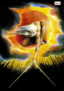

I chose the photo with the man touching the sky because it shows plenty of colors in the picture.
I chose the photo with the lights and colors because again it shows plenty of different colors throughout the picture.
Value, or tone, refers to dark and light; the value scale refers to black and white with all gradations of gray in between. Value contrasts help us to see and understand a two-dimensional work of art.


I chose the photo with the man holding a silver globe because it shows the contrast between the black and gray in the photo.
I chose the photo with the animal skull because in shows gray and black, also it shows a nice dark side in the photo.
Form describes objects that are three-dimensional, having length, width, and height.


Balance is the comfortable or pleasing arrangement of things in art. There are three different types of balance: symmetrical, asymmetrical, and radial. The human figure is symmetrically balanced; the same on the left and right side. The tree is asymmetrically balanced; its branches are not distributed equally on each side, but their total weight is balanced left and right. The sun is an example of radial balance; all its rays are equal in length from the center.

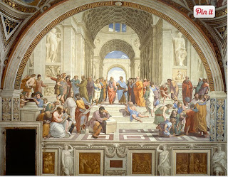
I chose the upper photo because you can split the picture in half.
I chose the lower photo because the painting looks identical on both sides.
Contrast is created by using elements that conflict with one another. Often, contrast is created using complementary colors or extremely light and dark values. Contrast creates interest in a piece and often draws the eye to certain areas. It is used to make a painting look interesting.


I chose the photo on the left because it shows the dark and light in the picture.
I chose the picture on the right because you can see the zebras black and white stripes.
Emphasis in the focal area of an artwork gives it importance. An artist may stress some elements of the design over others. The eye of the viewer will focus on the area of emphasis or center of interest first, then take in the rest of the composition.


I chose the photo on the top because the you can focus on the different things in the photo.
I chose the photo on the bottom because it's very eye popping and makes you focus on the tree.
Movement in an artwork means the artist is taking viewers on a trip through the work by means of lines, edges, shapes, and colors often leading to the focal area. Movement is a visual flow through the composition. It can be the suggestion of motion in a design as you move from object to object by way of placement and position. Directional movement can be created with a value pattern. It is with the placement of dark and light areas that you can move your attention through the format


I chose the upper photo because it shows the people in the painting moves and dancing.
I chose the lower photo because it shows the water flowing down into the pool.
Patterns are made in art when the same shapes or elements are repeated again and again. Pattern uses the elements of art in planned or random repetitions to enhance surfaces of paintings or sculptures.


Rhythm is the repetition of shapes, lines, and forms. Rhythm is a movement in which some elements recurs regularly. Like a dance, it will have a flow of objects that will seem to be like the beat of music.


I chose the painting of the bull because someone obviously used lines to draw the bull.
I chose the photo of the ceiling because it shows lines going up the building.
Shapes are formed wherever the ends of a continuous line meet. Geometric shapes such as circles, triangles or squares have perfect, uniform measurements and don't often appear in nature. Organic shapes are associated with things from the natural world, like plants and animals.

I chose the photo of the man and women because if you look close enough you can see the shapes used.
I chose the photo of the gate because you can see the squares in between the fences design.
Color wheels show the primary colors, secondary colors, and the tertiary (intermediate) colors. They also show the relationships between complementary colors across from each other, such as blue and orange; and analogous (similar or related) colors next to each other such as yellow, green, and blue. Black and white may be thought of as colors but, in fact, they are not. White light is the presence of all color; black is the absence of reflected light and therefore the absence of color.

I chose the photo with the man touching the sky because it shows plenty of colors in the picture.
I chose the photo with the lights and colors because again it shows plenty of different colors throughout the picture.
Value, or tone, refers to dark and light; the value scale refers to black and white with all gradations of gray in between. Value contrasts help us to see and understand a two-dimensional work of art.

I chose the photo with the man holding a silver globe because it shows the contrast between the black and gray in the photo.
I chose the photo with the animal skull because in shows gray and black, also it shows a nice dark side in the photo.
Form describes objects that are three-dimensional, having length, width, and height.

I chose the photo with the Police officer and the boy because it looks like a photo, which appears to look 3-D.
I chose the photo of the building because you can see the 3-D features of the building.
Texture can be rough, bumpy, slick, scratchy, smooth, silky, soft, prickly--the list is endless. Texture refers to the surface quality, both simulated and actual, of artwork.

I chose the painting on the left because it gives off the soft feel to the viewer.
I chose the photo on the right because you can see the roughness on the rocks through the photo.
Space refers to distances or areas around, between, or within components of a piece. Space can be positive (white or light) or negative (black or dark), open or closed,shallow or deep, and two-dimensional or three-dimensional.

I chose the photo on the left because you can see the space between the sticks.
I chose the photo on the right because you can see the windmills and how far away they are from each other.

I chose the lower photo because the painting looks identical on both sides.
Contrast is created by using elements that conflict with one another. Often, contrast is created using complementary colors or extremely light and dark values. Contrast creates interest in a piece and often draws the eye to certain areas. It is used to make a painting look interesting.
I chose the photo on the left because it shows the dark and light in the picture.
I chose the picture on the right because you can see the zebras black and white stripes.
Emphasis in the focal area of an artwork gives it importance. An artist may stress some elements of the design over others. The eye of the viewer will focus on the area of emphasis or center of interest first, then take in the rest of the composition.

I chose the photo on the top because the you can focus on the different things in the photo.
I chose the photo on the bottom because it's very eye popping and makes you focus on the tree.
Movement in an artwork means the artist is taking viewers on a trip through the work by means of lines, edges, shapes, and colors often leading to the focal area. Movement is a visual flow through the composition. It can be the suggestion of motion in a design as you move from object to object by way of placement and position. Directional movement can be created with a value pattern. It is with the placement of dark and light areas that you can move your attention through the format

I chose the upper photo because it shows the people in the painting moves and dancing.
I chose the lower photo because it shows the water flowing down into the pool.
Patterns are made in art when the same shapes or elements are repeated again and again. Pattern uses the elements of art in planned or random repetitions to enhance surfaces of paintings or sculptures.

I chose the upper photo because you can see the pattern between the people and how it never ends.
I chose the lower photo because you can see the repetition in the pictures with the arrows.
Rhythm is the repetition of shapes, lines, and forms. Rhythm is a movement in which some elements recurs regularly. Like a dance, it will have a flow of objects that will seem to be like the beat of music.
I chose the photo on the top because you can the rhythm in the picture with the soup cans.
I chose the photo on the bottom because you can see the repetition in the photo with the flags.
Unity means that all elements in an artwork are in harmony. Unity brings together a composition with similar units. For example, if your composition was using wavy lines and organic shapes you would stay with those types of lines and not put in even one geometric shape.

I chose the top picture because you can see the same shapes throughout the picture between the tree and explosion.
I chose the bottom picture because you can see repetition in the photo with the waves flowing through.
I chose the bottom picture because you can see repetition in the photo with the waves flowing through.
Wednesday, September 25, 2013
Avoiding Mergers

Subscribe to:
Posts (Atom)